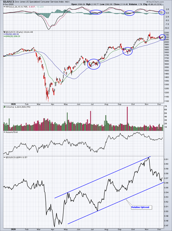
The first chart highlights the uptrend in specialized consumer services. The blue circles highlight periods of rest/consolidation where the daily PPO falls back near the centerline. This is nothing more than temporary rotation out of the group as Wall Street takes profits after nice runs to the upside. Once the consolidation ends, we see another surge in price. The big picture, in relative terms, is quite bullish and is illustrated in
the bottom panel of that first chart. The DJUSCS has been underperforming since early-November, but that's typical during periods of consolidation.
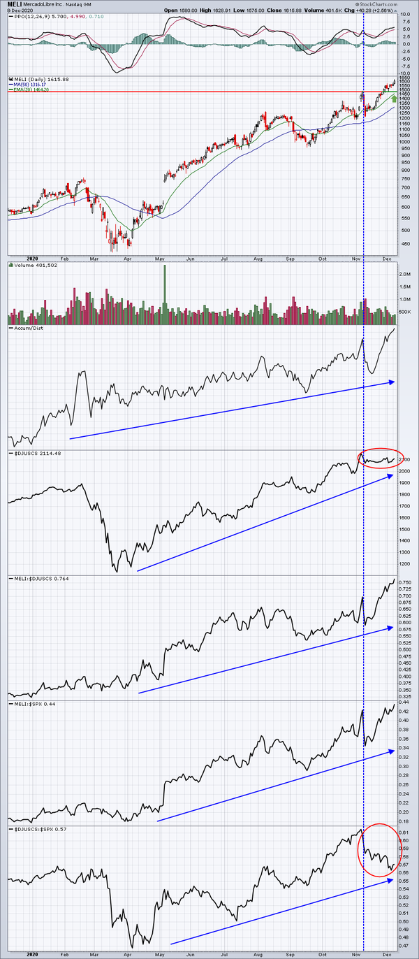
The second chart highlights that MELI is one of the best performing stocks in the DJUSCS. Any time you see those blue directional lines rising from the left side of the chart to the right side like you see on the MELI chart, you should be thinking, "leading stock in a leading industry". That's what those blue lines mean. MELI has recently broken out, but I'm not a fan of chasing. MELI posted better-than-expected revenues and EPS in its
latest quarterly report and it's included in our Strong Earnings ChartList (SECL), which is one part of our immense research platform. I typically run several scans against our various ChartLists throughout the trading day. Eventually, MELI will be returned with a scan result - perhaps a 20 day EMA test - and I'll be able to trade it from a much better reward to risk level. That's how we do things at EarningsBeats.com. We do our homework and sit back and wait for an
opportune time to jump into a leading stock in a leading industry group.