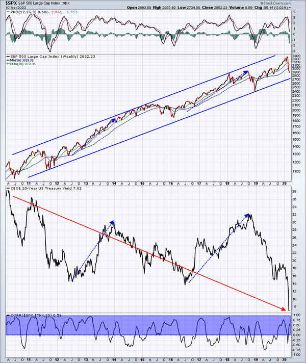
At first glance, it appears that stocks go up, while the 10 year treasury yield ($TNX) goes down. Since the yield moves inversely to bond prices, it would make sense from this chart that stocks and bonds move up together. Over long periods of time, that is mostly true. But during shorter periods, it's the exodus from bonds (and rising yields) that really fuels a stock market advance. The blue-dotted directional lines
above help to illustrate that. And while the long-term relationship between stocks and the TNX might appear to move in opposite directions, check out the correlation indicator below the charts. The blue highlighted area shows that correlation is positive most of the time.
The moral of the story? The stock market's biggest advances occur when money rotates OUT of bonds, sending yields higher.
Happy trading!